New Look & Feel

While the heart of any website is its content, looks are important, too. We’re visually refreshing the platform with new fonts, an alternate menu option, an alternate homepage layout, and updated header and footer options — along with a few new widgets.

New Look for Sites is Here!

The recently launched new look for Drupal Department Platform websites is designed to complement other Michigan Medicine sites while also accommodating all your existing content and page layouts.

Where possible, we’re also providing more flexibility so you have additional choices for displaying your site navigation menu and your homepage, providing an attractive front door for your site.

To learn more about all the changes, read our announcement.

Preview of New Look

Screenshot of website homepage showing new fonts and layout options.
The new look or "theme" is designed to work with existing content published on your site while providing a visual refresh.

The new look-and-feel uses new heading fonts and new content widget options to create an updated look, while still working with existing website content and page layouts.

Screenshot of website header quicklink buttons

New optional header links. You can list up to 3 links below the search box in your website header. You might use these for important high-traffic pages, such as for making a clinic appointment, or for internal department resources, such as an intranet site.

You can add these links by editing your department homepage and choosing the tab called Header Quick Links.

Screenshot of webpage image blocks with button overlay
There will be two styles of Callout Blocks — one with a gray text overlay and zoom-in hover effect and one with a blue text overlay and no zoom-in hover effect.

A widget called Callout Blocks allows you to pair up to 3 images with a text & link overlay to promote important sections of your website. You might use these to highlight specific audience groups (e.g. "For Researchers," "For Trainees," "For Faculty") or to highlight your missions (e.g. "Clinical Care," "Research," "Education").

Screenshot of webpage carousel with text overlay in lower left corner

With the new look, the carousel overlay for full-width carousel slides shifts to the lower left corner of the image to reduce the chance that the text overlay will cover up an important part of the image. The text overlay itself remains optional, and you can turn it off if you like.

Screenshot of webpage carousel with image buttons beneath
A combination of a full-width carousel slide with 3 Callout Blocks below.
Screenshot of website image banner above website footers

On the homepage, you can also add an optional footer banner image with a text overlay and an optional link styled as a button.

You can create this banner by editing your department homepage and choosing the tab called Bottom Image Banner. 

New Navigation Option & Styles

Screenshot of website homepage showing top navigation style option
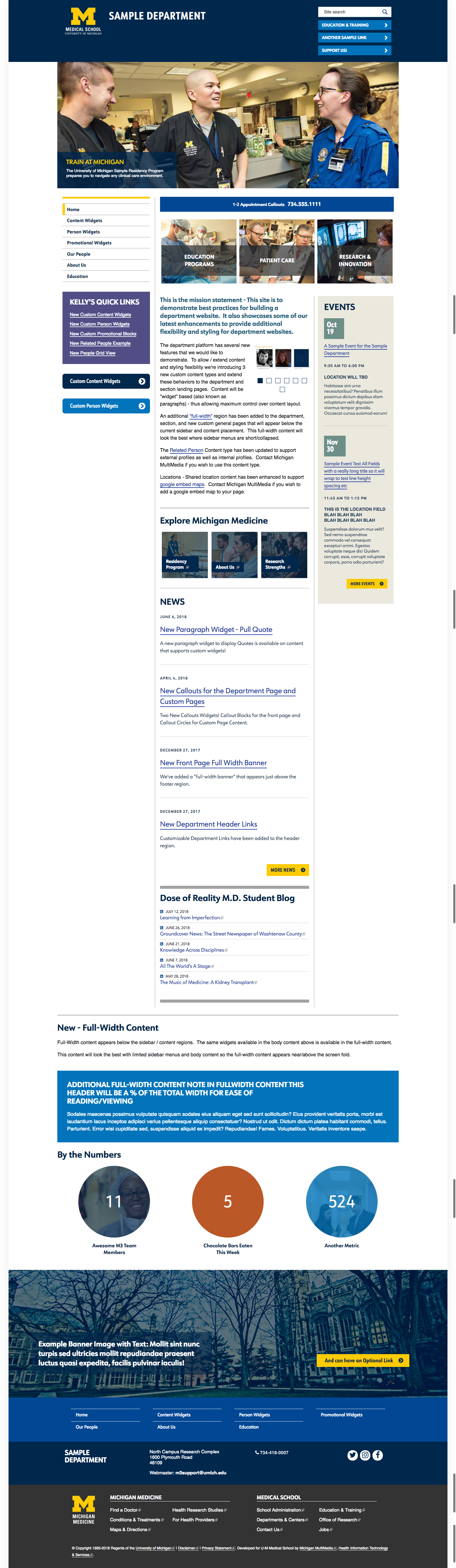
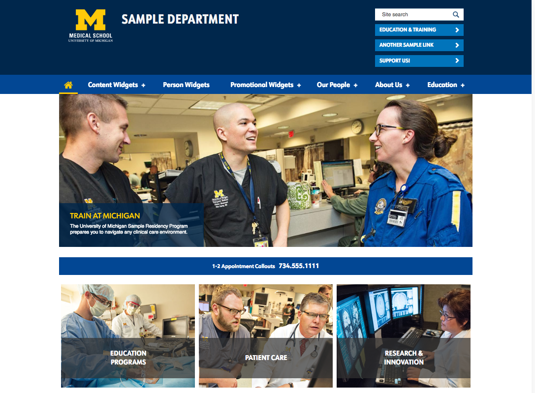
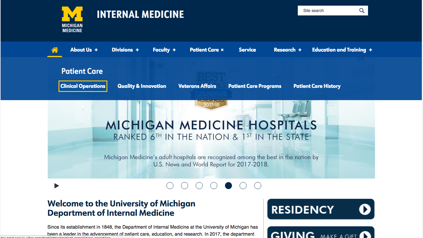
Top navigation has a 100-character limit so that the menu links do not wrap to a second line.

We've added an optional top navigation option, which will display up to 100 characters of top-level menu links (e.g. "top tabs"), and use dropdowns to display second-level child pages in each section. For sites using top navigation, sub-pages will still display in side navigation once you click into the section of content to read more.

If you’d like to convert from the regular left navigation menu to a top navigation menu, you’ll need to book an appointment to meet with us. Submit a ticket to HITS to the attention of Web Presence Team / Michigan MultiMedia.

We’ll work with you to review your current site structure and figure out how best to translate it to top nav while reducing the risk of broken links resulting from changing page titles and URLs.

Learn More About Top Nav

A few things you can be thinking about now, if you’re interested in top nav:

  • Top navigation will have a 100-character limit for words in the navigation bar. This usually translates to about 5-8 top-level categories or “top tabs,” depending on the length of the words.
  • Single-word page titles work best for the “top tab” items in top nav, to avoid text wrapping in an unattractive way.
  • Dropdown menus for top nav will list the next-level child pages in each “top tab” section. Ideally, limiting the number of next-level child pages will reduce information overload when viewing them in a dropdown menu. A good number to shoot for is 5-8 next-level child pages per section. Third-level (and beyond) child pages will display in a side nav menu, rather than the dropdown, to provide the greatest flexibility for having a lot of content on a single website.
  • Top nav is the only menu option available for use with the new alternate homepage layout. If you’re interested in the alternate homepage layout, you’ll need to be ready to convert to a top nav structure for your site.
Screenshot of top navigation menu on a website showing dropdown menu panel
The plus sign next to a menu link in top nav indicates it has sub-pages. Clicking on the link opens a dropdown panel displaying the second-level child pages in that section.
Screenshot of new side navigation menu styling
Updated styling for the left nav menu.

We've updated the styling of side navigation to match the new visual look.

Alternate Homepage Layout

We're offering an optional alternate homepage treatment that swaps in a new image-driven billboard supported by call-to-action buttons in place of a rotating carousel.

This alternate homepage layout uses top navigation style only. This design also features two unique content widgets: Callout List and Front Color Blocks, which are used to create the full-width content styling that appears before the usual News / Events / Body regions.

New Content Widgets

We're also adding 4 other content widgets. Visit each item to learn more about how it works: